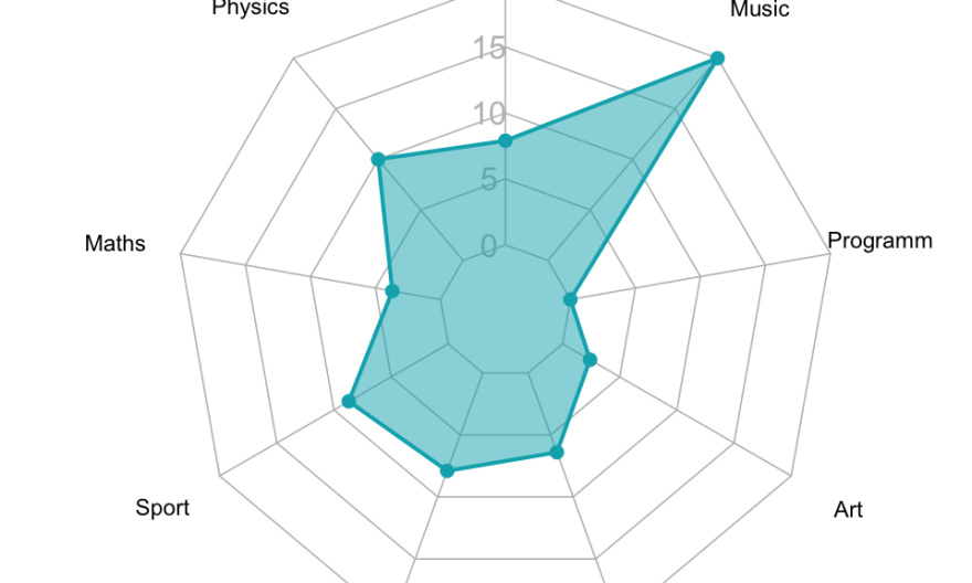
A radar chart, also known as a spider chart or web chart, is a graphical tool used to display multivariate data. It is a two-dimensional chart that uses a radial layout to display data points that are distributed around a circle. The radial layout allows for easy comparison of data points at different angles. The spider chart is used to compare different data sets and to identify relationships between data sets.
The radar chart gets its name because the chart resembles a radar screen with its array of lines radiating from a center. The radial distance of each data point from the center is proportional to the value of the data point. The angle of each data point is representative of the data point’s position on the spectrum of values.
This explanation may take care of your question on “what is a radar chart?” but you’ll likely want to know how to correctly use one and see some practical uses for it. Here’s how you can make your own radar charts and some common use cases, so you can start using radar charts to benefit your organization.
How to Create a Radar Chart
To create a radar chart in Excel, you first need to create a table of data to use for the chart. The table should have at least three columns: the first column should contain the name of the variable, the second column should contain the first data set for the variable, and the third column should contain the second data set for the variable. Depending on the size of your organization, you may want to invest in managed services in order to quickly gather this information and track your data in real-time.
Once you have created the table of data, you can create the radar chart by selecting the data and then clicking on the Insert tab and selecting the Radar Chart button. Excel will then generate the chart. The radar chart can be customized to show more or fewer data points, and the data can be sorted in any order. You can also add labels and change the colors and formatting of the chart.
Radar Chart Use Cases
Radar charts are a great way to visualize data, as they can show both trends and outliers. They can be used to compare different data sets or to track data over time. Here are just a few common use cases for radar charts that your organization might take advantage of.
You can use radar charts to compare the performance of different products in terms of different metrics. This can help you to identify the best-performing product and make decisions about which products to continue to sell. For example, you can use radar charts to display the performance of your company’s products in different regions of the country or to compare performance data for different time periods.
Radar charts can be also used to track the progress of a project over time. This can help you to identify any delays or problems that may have occurred in major projects, such as undergoing a digital transformation, and make changes if necessary. You can even use radar charts to compare the performance of different teams in terms of different metrics. This can help you to identify the best-performing team and make decisions about which team to assign new tasks to. Some other examples of projects that radar charts can help with include tracking sales campaigns, displaying customer data, keeping up with employee performance, and more.
Ultimately, radar charts are best used when you have multiple performance metrics to track and you need to see outliers right away. Some potential disadvantages of these charts include difficulty in quantifying radial lengths and the visual layout may encourage forming connections where there are none.